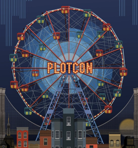
 The “most visionary conference for data visualization in scientific computing, finance, business, and journalism,” PLOTCON took place for the first time in NYC 15-19 November 2016. The conference hosted data scientists, engineers, programmers, journalists, and business analysts versed in Python, R, Julia, D3.js, Plot.ly, Tableau, and many more. The main focus was dissemination of best practices in data visualization and exposure to some of the cutting edge technology and solutions.
Here are five things we learned at PLOTCON:
- Good Viz Works.
- We can try to illustrate uncertainty in the data using animation.
- We should use perceptually uniform colormaps.
- When to use what visualization, with examples.
- “Tip of the iceberg” of HIPAA violations: we know about a lot less than is actually happening.
(Links are to the actual talks, highly recommended to watch at 1.5 speed: Settings –> Speed)
The complete list of talks can be found here: https://www.youtube.com/user/plotlygraph
The slides will be available on Slideshare early next week.
—————————-
Bonus takeaways from PLOTCON:
Data Management:
- How to build a modern Data Catalog: https://www.youtube.com/watch?v=eFC3k1Y95f4
- A data catalog provides context to help data scientists and other data consumers find a relevant dataset, determine if it can be trusted, understand what it means, and utilize it to make better products and better decisions.
- A way to keep data and code together with your publication via Authorea https://youtu.be/xJLE7Mruiqg?t=1608
GIS
- MAPD: incredibly fast interactive visualizations of billions of data points in real-time via GPUs: https://youtu.be/9z-nHmEm5JE?t=898
- Visualizing the racial divide: https://youtu.be/MmdPSgzfR5Y?t=1179
R
- Excellent talk about wrangling data into shape for visualization: https://www.youtube.com/watch?v=4MfUCX_KpdE
- Amazing talk by Hadley Wickham (Chief Scientist at RStudio) on conceptualizing data manipulation for analysis and visualization: https://www.youtube.com/watch?v=cU0-NrUxRw4
- Animation within R with gganimate: https://www.youtube.com/watch?v=9Y7Y1s4-VdA
- Mosaic Plots with ggmosaic: https://www.youtube.com/watch?v=TWr2JuILX74
HPC
- An interesting way to visualize performance of a program via a flame graph: https://youtu.be/0ODOZ4-U1VE?t=924 and skipping to python implementation: https://youtu.be/0ODOZ4-U1VE?t=1679
Other useful things:
- A demo of really nice features of Plotly: https://www.youtube.com/watch?v=5pjh1ThQoUs
- There’s way to put Tableau and Plotly together, although a little brute-force for now:
